Working with Reports
Learn how to create and organize reports on your dashboard:Add New Reports
Add New Reports
Start creating a report in one of these ways:
- Click
+ Add Reportin the top right for a new report - Use
⋮>Duplicateto copy an existing report
Edit Reports
Edit Reports
Select
⋮ > Edit to modify an existing report. This will send you to the report configurator view explained below.Delete Reports
Delete Reports
You can delete reports by clicking
⋮ > Delete.Arrange Reports
Arrange Reports
Move reports anywhere on your dashboard with drag and drop: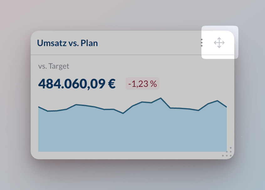
Resize Reports
Resize Reports
Resize reports by using the handle in the bottom right corner: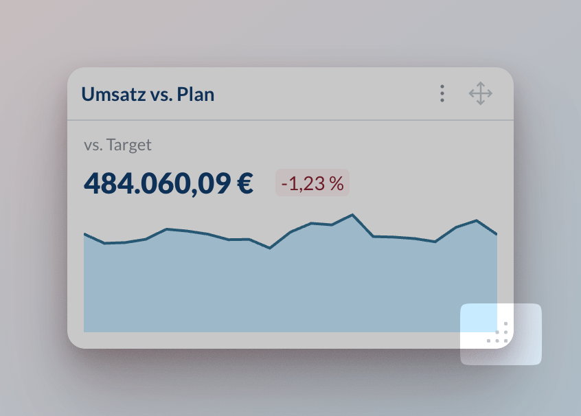
Export Reports
Export Reports
Share your reports in two formats: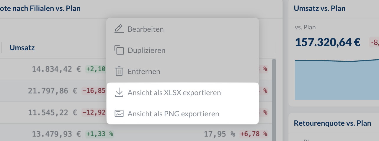
- Excel file: Click
⋮>Export view as XLSX - Image: Click
⋮>Export view as PNG
Report Configurator
Follow these steps to select the right visualization, metrics, and filters for your data. A well-configured report will help you spot trends faster and make better decisions.Set the report title
Enter a title or use the auto-generated one based on your selections. We recommend using a custom name when report filters are applied as this helps you keep track of what you are looking at.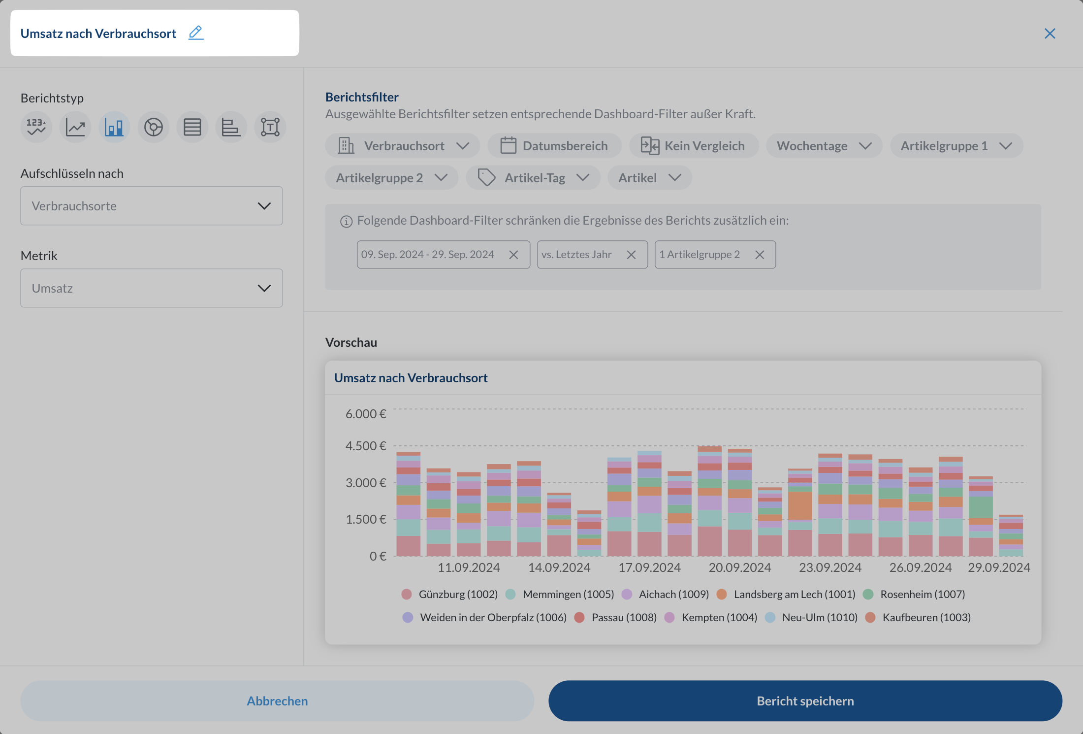
Select the report type
Choose the best visualization for your data:
Mini chart/Line chart: See trends and changes over timeBar chart/Pie chart: Compare values and show distributionsTable/List: See detailed data with sorting optionsText: Add headings and explanations
Set metrics and grouping
Pick what you want to measure and how to group it. Available options change based on your report type.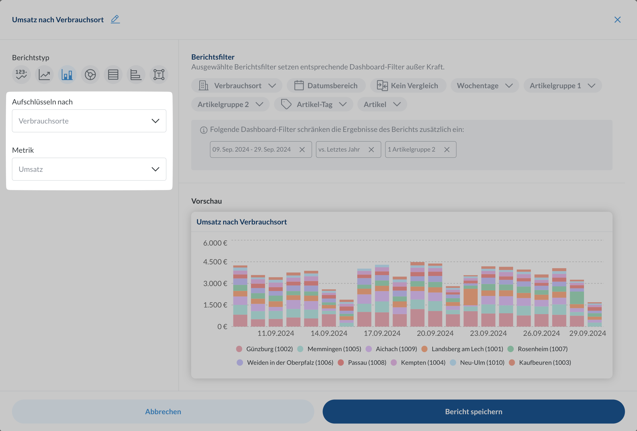
Configure filters
Narrow down your data with report level filters. These override dashboard filters, which you can see and reset with the 
X button. Learn more about filtering and drill-downs and automatic comparisons.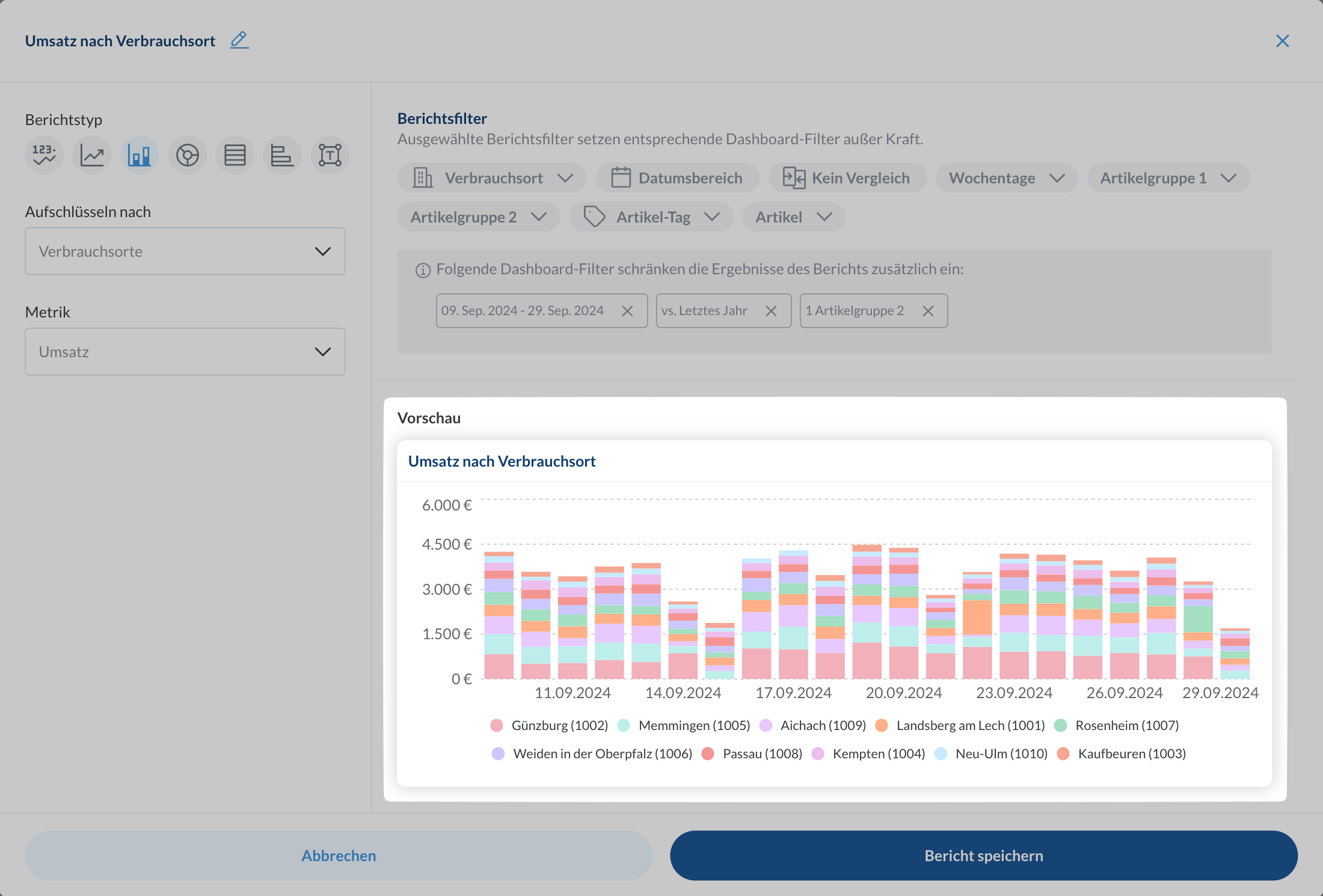
You can create reports on any device, but desktop gives you the best experience.
Report Types
Mini Chart
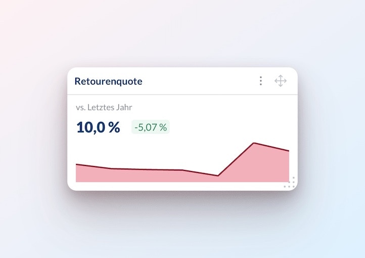
- Monitoring KPIs
- Showing simple trends
- Dashboard headers
- Space-efficient overviews
Metric: Select what you want to track
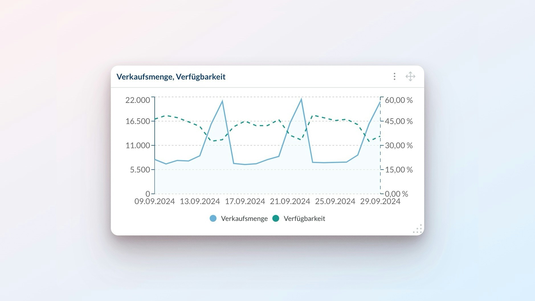
Line Chart
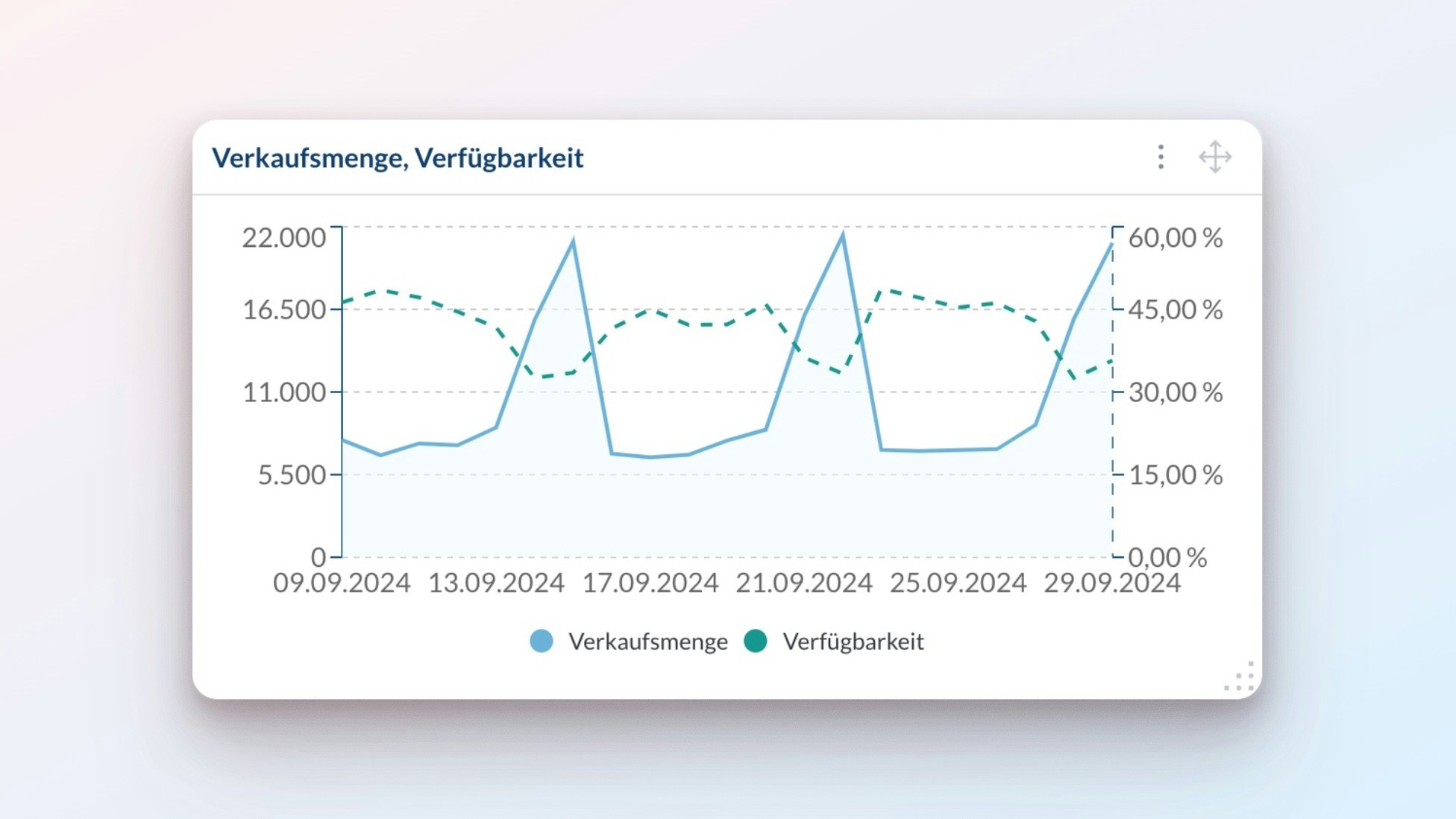
- Sales analysis
- Growth tracking
- Performance monitoring
- Comparing multiple metrics
Metrics left y-axis: Pick metrics to show as solid linesMetrics right y-axis: Add more metrics as dashed lines (optional)
Metrics on the same axis must use the same unit (pieces, EUR, %, etc.).
When mixing time granularities (e.g., hourly and daily), the chart uses the lower granularity.
Bar Chart
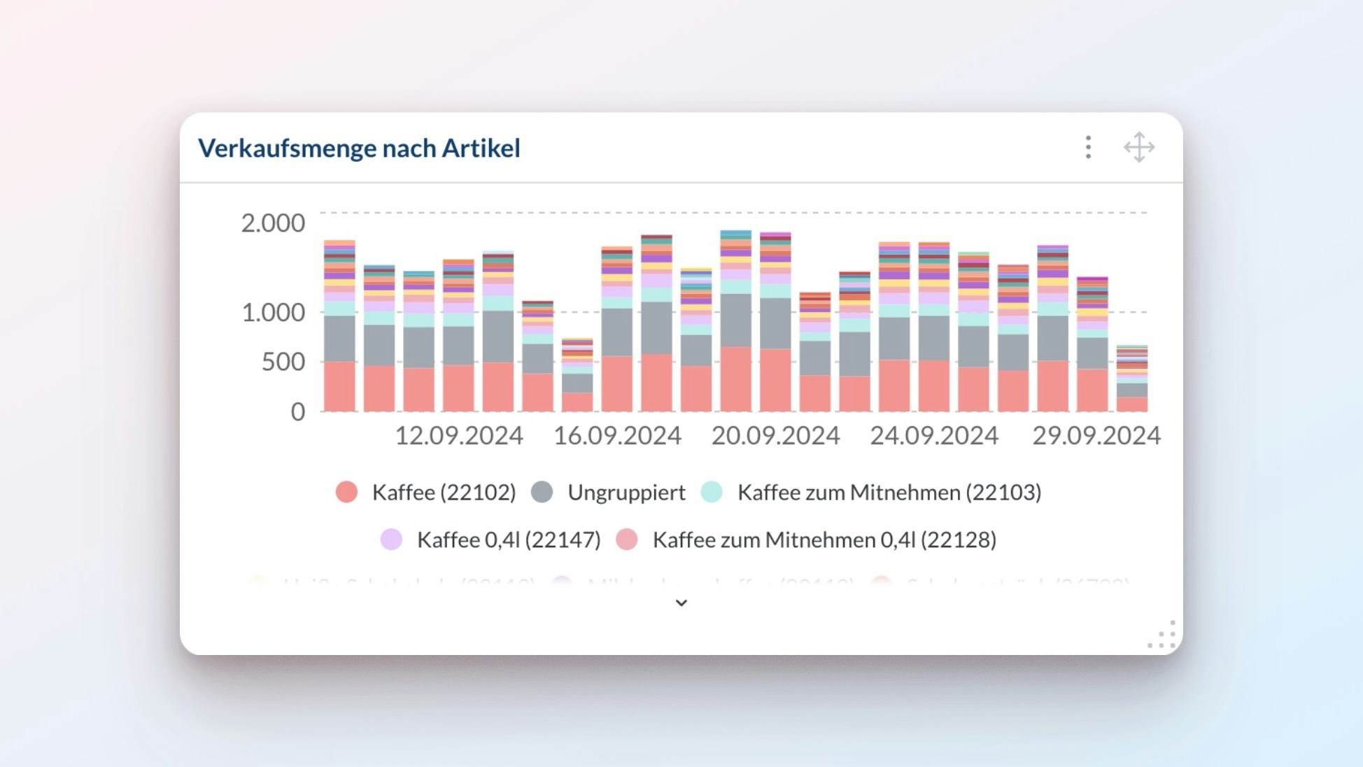
- Product comparisons
- Location performance
- Time period analysis
- Category breakdowns
Break down by: Pick how to group your data (location, item, etc.)Metric: Choose what to measure
You can only use metrics that add up meaningfully:
- Works:
RevenuebyLocation(amounts add up) - Doesn’t work:
Return ratebyItem(can’t add percentages)
Pie Chart
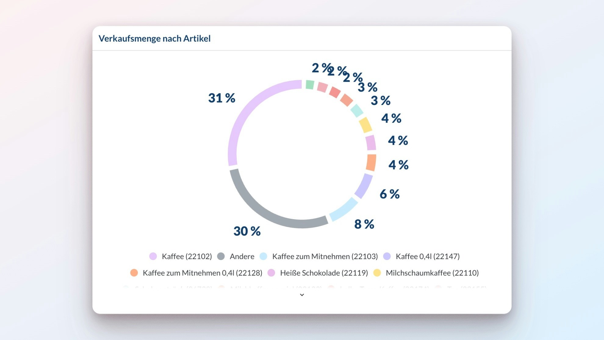
- Market share analysis
- Category distribution
- Sales mix
- Resource allocation
Break down by: Pick how to group your data (location, item, etc.)Metric: Choose what to measure
You can only use metrics that add up meaningfully:
- Works:
RevenuebyLocation(amounts add up) - Doesn’t work:
Return ratebyItem(can’t add percentages)
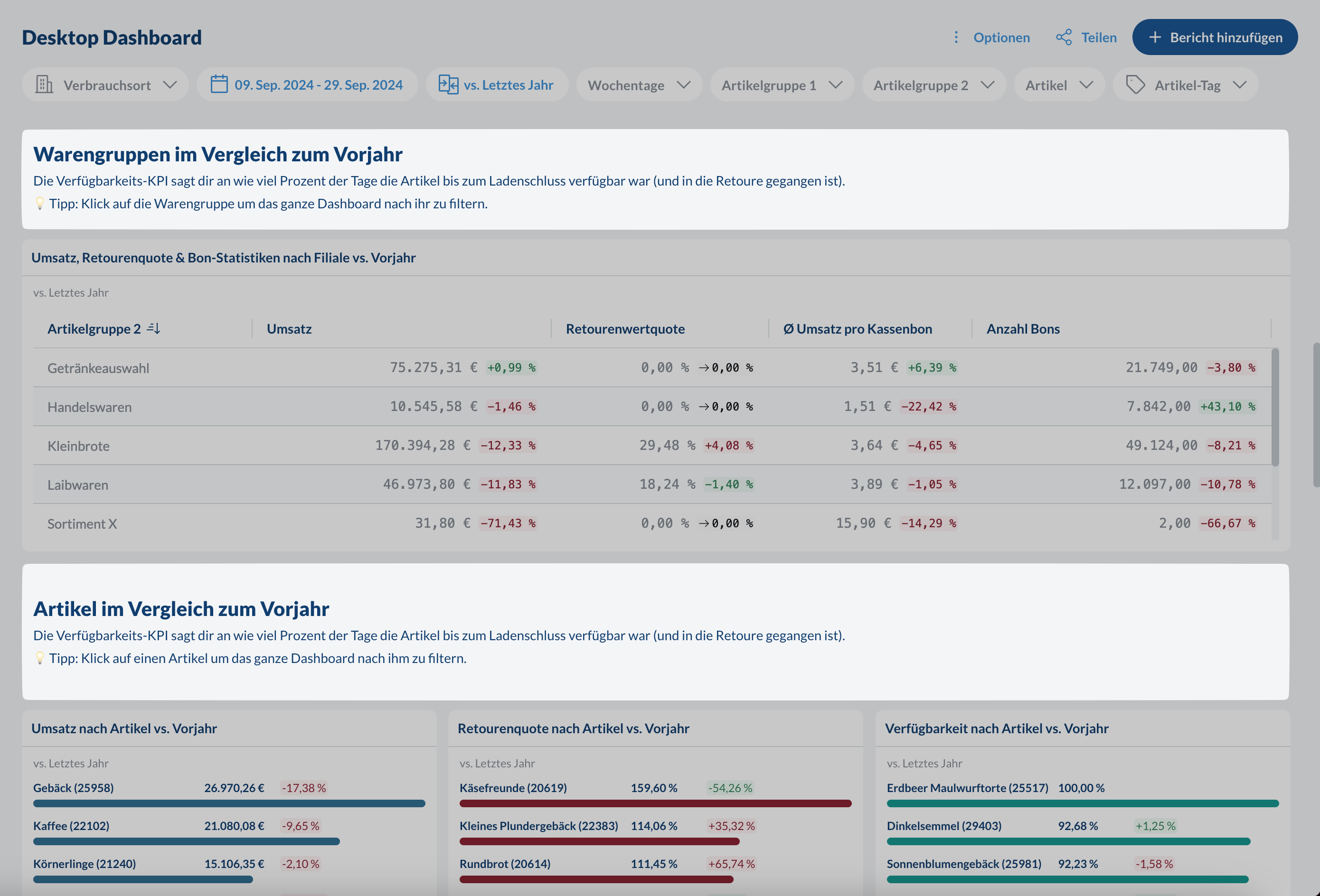
Table
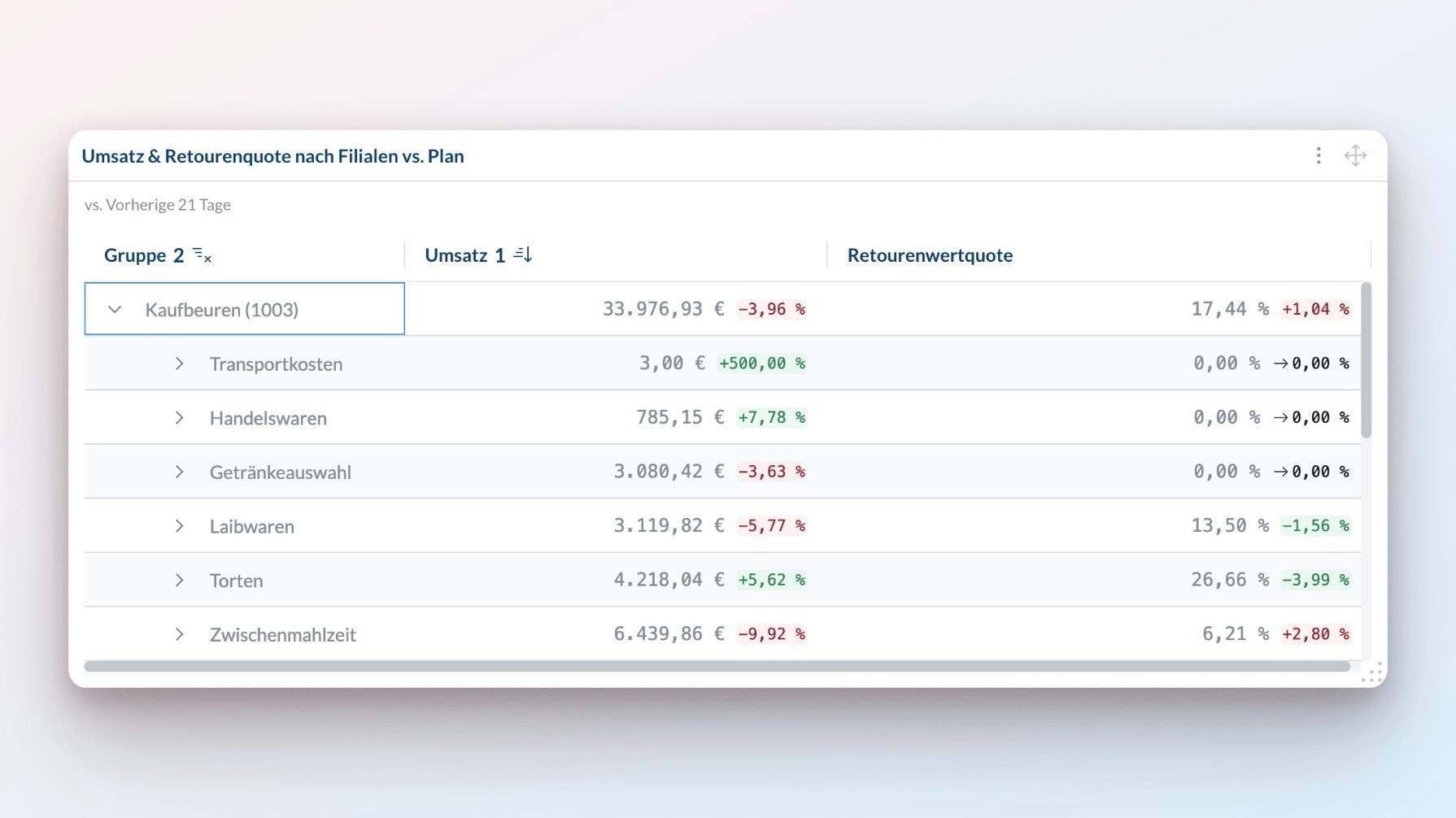
- Sort any row and column
- Group data in expandable rows
- Group data in pivot columns
+ Add rows: Pick how to group your data by rows (location, item, etc.). You can sort by the chosen group or by any metric.+ Add columns: Pick how to group your data by columns (location, item, etc.). You can sort by the chosen group or by any metric.+ Add metrics: Choose what to measure
List
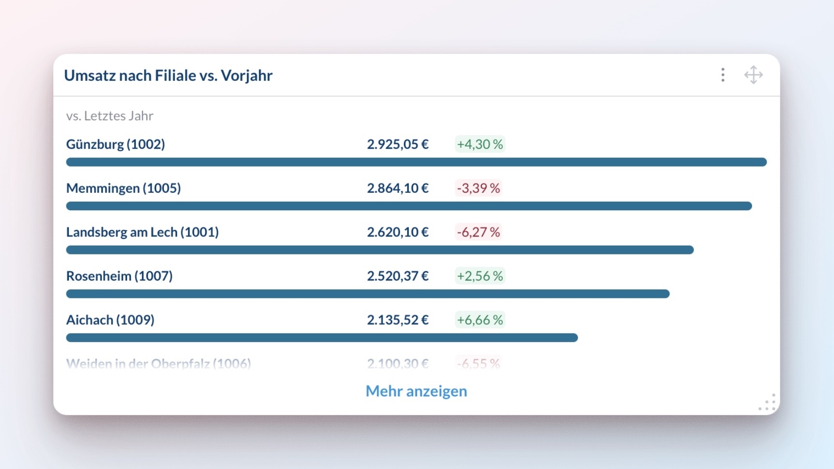
- Top performers
- Priority items
- Quick rankings
- Status updates
Break down by: Pick how to group your data (location, item, etc.)Metric: Choose what to measure
Text
- Section headers
- Notes and explanations
- Instructions
- Important updates
- H1 and H2 section headers
- Bold, Italic, Underscored,
Strikethroughformatting and Hyperlinks - Bulleted and numbered lists
- Uploading images via drag and drop
- Horizontal dividers